What Is RRG? Reading Relative Rotation Graphs
A practical introduction to relative strength, momentum and the four quadrants—with IndexBreadth chart examples.

Which stocks are gaining leadership—and which familiar leaders are quietly losing it?
That is the question I would bring to a Relative Rotation Graph. A green day in the Nifty tells us that the index rose. It does not tell us whether leadership is shifting from banks to healthcare, whether yesterday’s strong stocks are slowing, or whether previous laggards are beginning to catch up.
I think the appeal of RRG is how much of that comparison it puts in front of us at once. The picture becomes a starting point for research: where is strength established, where is it improving, and where does a closer look seem worthwhile?
What is a Relative Rotation Graph, and who created it?
Relative Rotation Graphs, or RRGs, were created by Julius de Kempenaer. His contribution was a distinctive way of bringing relative-strength trends and their momentum together in one visual comparison. Visit the official Relative Rotation Graphs website to explore his work and the RRG framework. Readers can also explore Julius de Kempenaer’s work at StockCharts.
Relative Rotation Graphs and RRG are trademarks associated with RRG Research.
Why this changed the way analysts visualise relative strength
Imagine reviewing a long watchlist with one ratio chart open at a time. Each chart can tell a useful story, but you still have to remember the earlier charts, compare their trends and decide which changes deserve attention.
RRG brings those relationships into a shared view. Instead of only asking whether one security is outperforming a benchmark, we can also examine how its relative momentum compares with the rest of the group.
That is an elegant advance in presentation. Ratio charts were not incorrect. Their limitation is that a collection of raw ratio levels is not a ready-made ranking of strength: securities have different price scales, and the level of one ratio cannot simply be compared with another. Reviewing many separate histories also becomes cumbersome.
I would still keep a ratio chart beside the price chart for detailed work. The rotation view helps decide which comparisons to investigate first.
How to read the overview
Tap any chart in this article to open the full-size image.
In the standard RRG framework, the horizontal dimension describes relative strength and the vertical dimension describes its momentum. The four areas distinguish established leadership, fading momentum, relative weakness and improving momentum. StockCharts provides a public introduction to the original RRG framework.
The IndexBreadth examples here display axes labelled Relative Strength and Momentum. They are used to explain the visual reading; this article does not describe or equate IndexBreadth’s internal calculations with the original proprietary measures.
Start with the latest labelled dot, then follow the trail leading into it. The endpoint answers “where is it now?” The trail adds “how did it get here?” Two stocks in the same quadrant can have very different recent paths.
These supplied exports do not display the benchmark, observation date or bar interval. Treat them as learning illustrations, rather than dated stock recommendations. In a live reading, check those settings before making comparisons.
Leading: strength with supportive relative momentum
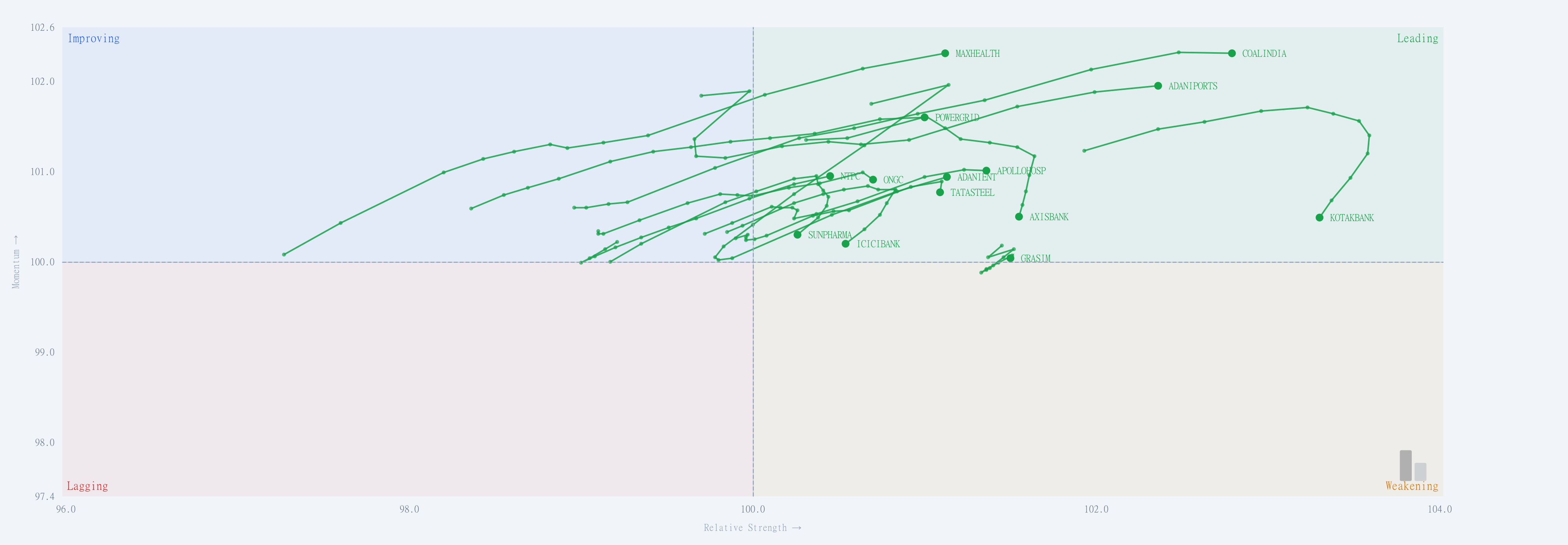
The upper-right area combines stronger relative positioning with positive relative momentum. The supplied Leading view includes labelled endpoints such as COALINDIA, MAXHEALTH and ADANIPORTS.
I would look beyond the green colour. Is the recent trail continuing higher, flattening, or turning down? A stock can remain in Leading while its momentum starts to soften. That difference helps distinguish ongoing leadership from leadership that needs closer monitoring.
This is a relative comparison. Being in Leading does not, on its own, establish that a stock’s price is rising.
Improving: a change worth investigating
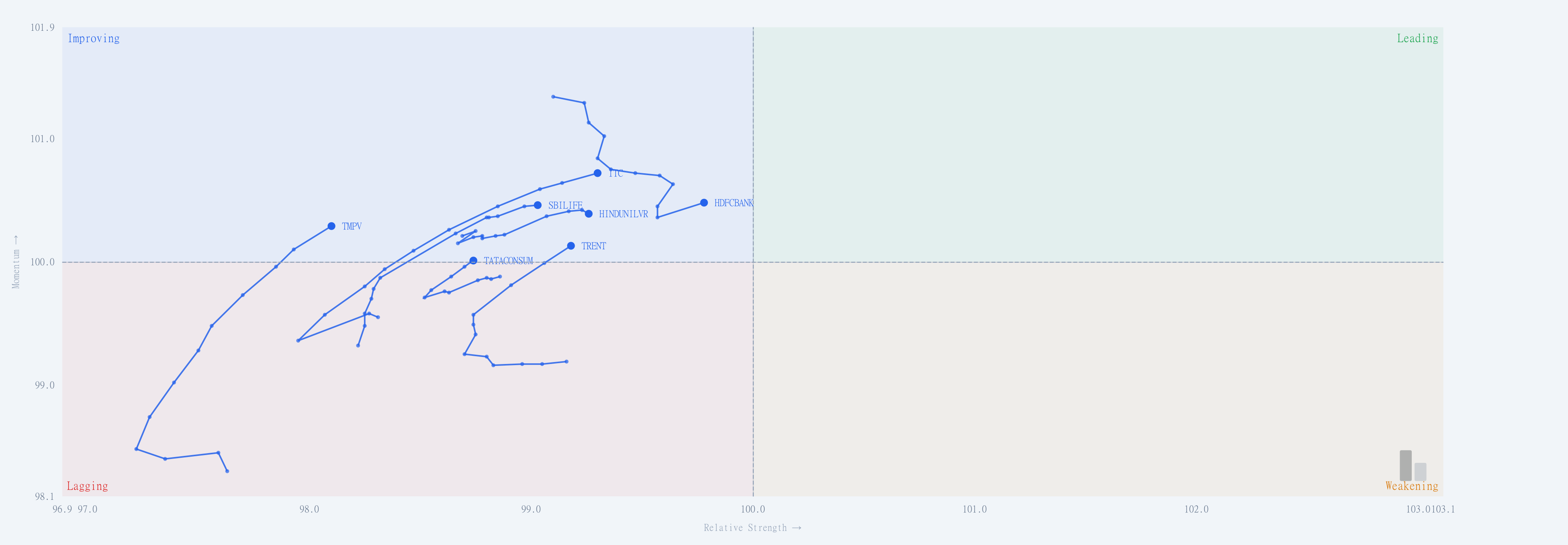
The upper-left area describes improving relative momentum while relative strength remains on the weaker side of the centre. The focused export makes the paths of HDFCBANK, ITC, TRENT and other names easier to follow.
This is often the interesting research question: is an earlier laggard beginning a more meaningful recovery? I would examine whether the price chart is also improving and whether other stocks in its sector are participating. A blue endpoint alone does not settle either question.
Improving is a description of the current relative condition, not a promise that the next stop must be Leading.
Weakening: an existing leader losing momentum
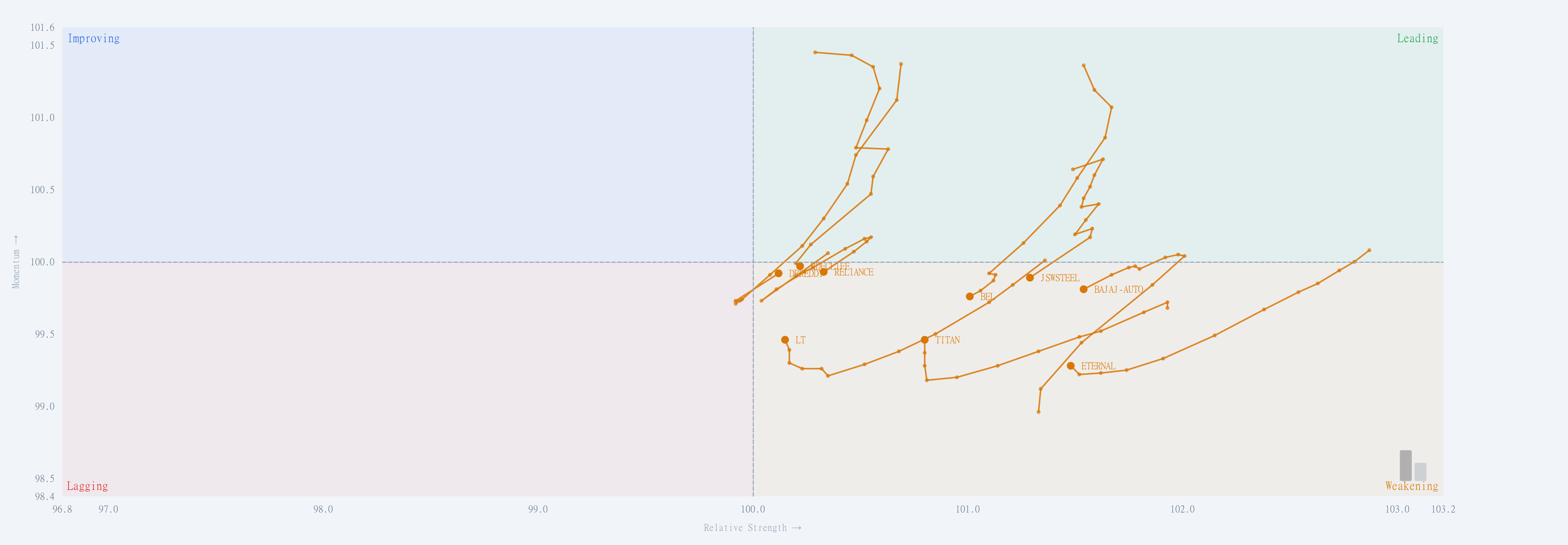
The lower-right area retains stronger relative positioning but has weaker relative momentum. TITAN, BEL and BAJAJ-AUTO are among the labels in this supplied view.
For an existing watchlist, this helps identify where the leadership story may be changing. I would revisit the stock’s price structure and its benchmark comparison. Some leaders recover momentum and return to Leading; others deteriorate further. The trail provides context for that review, rather than an automatic instruction to sell.
Lagging: relative weakness, with different paths inside it
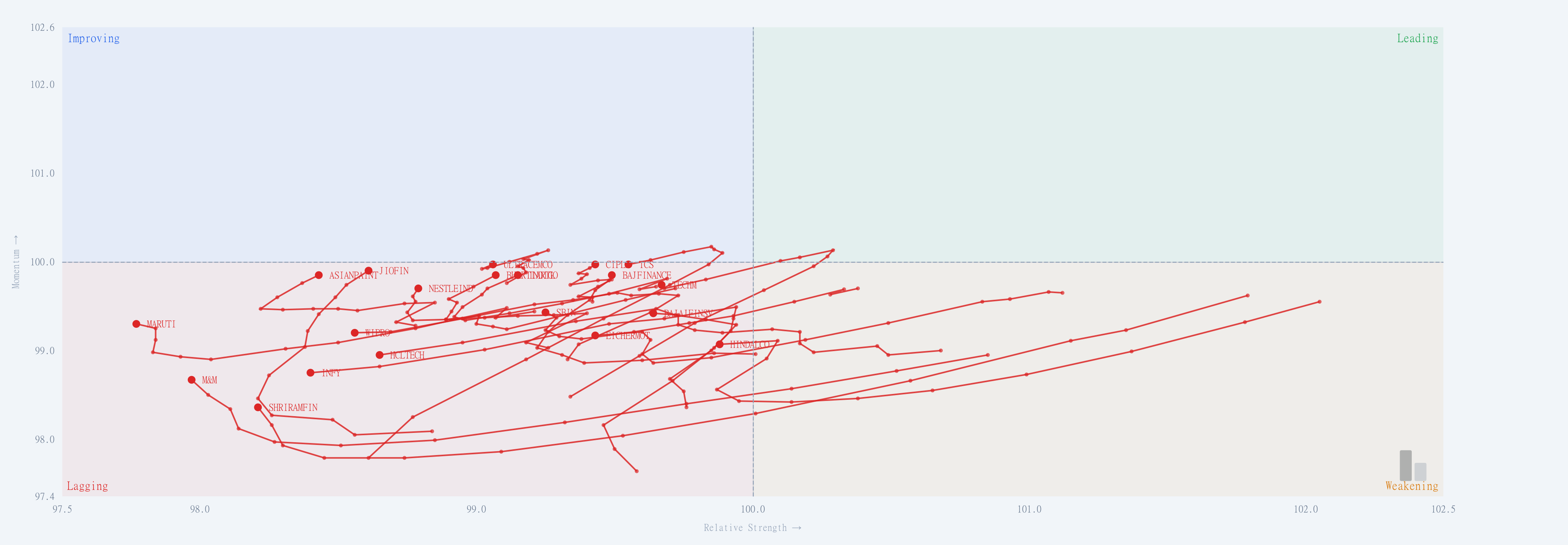
The lower-left area combines weaker relative strength with weaker relative momentum. This export includes names such as INFY, MARUTI and HCLTECH.
Even here, the direction of travel matters. A trail beginning to turn upward deserves a different reading from one still moving down and left. I would use that distinction to organise further research, while checking whether the apparent improvement persists in subsequent observations.
The four filtered views show different groups from the supplied overview. Their axis ranges adjust, so compare the displayed coordinates and paths rather than judging movement by the length of a line on your screen.
What other RRG views and variations matter?
The same broad visual approach can support several types of comparison:
- Sector comparisons: examine leadership across sectors against a chosen broad-market benchmark.
- Stocks within a sector: compare peers against a sector benchmark to separate sector strength from stock-specific leadership.
- Broader stock universes: review a selected group against a common index, then narrow the view to reduce clutter.
- Daily and weekly views: investigate shorter-term changes alongside a slower picture. Their observations represent different time intervals, so disagreement is possible.
- Shorter and longer trails: use recent observations for a cleaner view or a longer trail for context. Keep the bar interval consistent when comparing movement.
More advanced discussions include heading, distance from the centre, velocity and position-based measures. These describe different aspects of the plotted path. They should not be treated as interchangeable measures of investment risk or as proven trading rules. Nor should the reader assume that every advanced variation is available in every platform.
How I would combine rotation, price and market breadth
My first step would be to choose a meaningful benchmark and a timeframe that matches the question. A sector-versus-market comparison and a stock-versus-sector comparison answer different questions.
Next, I would use the rotation view to build a short research list. I would then inspect each name’s price chart and ratio trend. Finally, I would check participation: is the apparent strength shared across the group or concentrated in a few names?
That last question is where market breadth adds another useful dimension. Relative leadership and broad participation are related questions, but they are not the same measurement. Our guide to comparing sector breadth and timeframes explains why consistent comparisons matter.
What can give a misleading reading?
A hypothetical stock falling 4% while its benchmark falls 10% is outperforming over that period, even though its holder has lost money. Relative improvement must therefore be read separately from absolute returns.
Changing the benchmark can also change the picture. A strong stock relative to a weak sector may tell a different story when compared with the broader market. A short-lived turn in a daily trail may not change a longer-term weekly relationship.
Finally, rotation is not a timetable. Securities need not complete a neat circuit through every quadrant, and a stretched trail does not by itself prove that a reversal is imminent.
Where to explore the charts
Use the IndexBreadth chart examples above to practise reading the endpoint, recent direction and quadrant together. For the next step, open IndexBreadth and review the relative-strength views alongside the market’s participation readings. New readers can create an IndexBreadth account.
I think RRG’s lasting contribution is the clarity it brings to a difficult comparison. It makes the changing relationships between securities visible, so the analyst can spend more time examining the most relevant price and breadth questions.
Educational discussion. The chart labels illustrate a reading method and are not recommendations to buy or sell the securities shown.