Comparing Sector Breadth: Match Universe and Timeframe
A stronger percentage is only meaningful when the comparison is fair.
A sector shows 70% participation and another shows 60%. Is the first sector really stronger, or have we compared different things?
Before ranking the readings, I want to know what was counted, which stocks were eligible, and when the observations were taken. Those details can change the answer more than a colourful ranking table suggests.
Use one question for both baskets
Suppose the question is how many stocks close above their own 50-session simple moving average. For sector s:
P(s,t) = 100 × B(s,t)/E(s,t).
B is the eligible stock count meeting the condition, and E is the eligible count in that sector. We use the same closing-price convention and observation date for both baskets.
The general percentage-above-average concept is documented in StockCharts’ participation reference. Here, I am focusing on how to compare two samples, not proposing a sector trading rule.
Two hypothetical Indian sector baskets
| Basket | Eligible stocks | Above the average | Participation |
|---|---|---|---|
| Sector A | 10 | 7 | 70% |
| Sector B | 40 | 24 | 60% |
Sector A has a higher participating share. Sector B has more qualifying stocks in absolute terms. Those statements can both be true.
One stock crossing below the average would move Sector A from 70% to 60%: ten percentage points. The same one-stock change in Sector B would move it from 60% to 57.5%: 2.5 percentage points.
I would therefore be cautious about treating every percentage-point move as equally significant across small and large baskets. The arithmetic sensitivity is different.
Do not average the sectors blindly
If these baskets are disjoint and have full coverage, combined participation is 100 × (7 + 24)/(10 + 40) = 62%.
The simple average of their percentages is 65%. That gives equal weight to each sector, not to each stock. Neither aggregation is inherently forbidden, but the weighting answers a different question.
If the baskets overlap, adding their counts double-counts shared stocks. A stock-level combined universe needs duplicates removed before computing its participation.
The timeframe can change the variable
A 50-session moving average from daily closes uses daily observations. A 50-bar average on an hourly chart uses hourly observations. The latter is not a 50-day average simply because the period number is the same.
Likewise, hourly advances may refer to a change from the previous hourly close or to a change from the previous day’s close. Read the label or methodology. Do not assume the reference merely from the chart’s display interval.
A daily breadth value sampled once a week is also not automatically weekly breadth. Weekly close-to-close advances require a comparison between weekly closes.
My practical reading order
I would check the universe, eligible coverage, condition, lookback and timestamp before calling a sector leader. Then I would compare that participation with the sector’s price behaviour. Internal participation and price outperformance are separate observations; one does not guarantee the other.
On IndexBreadth, use the visible universe and timeframe controls deliberately. This lesson does not infer how any proprietary rotation view is built. For the denominator groundwork, read the eligible-stock guide.
Reading the IndexBreadth charts
These exports illustrate differences across sectors and across timeframes. The sector views show how readings vary across the selected baskets. The Nifty 500 pair shows daily and hourly views. Their history windows differ, so compare overlapping dates rather than aligning the left edges.
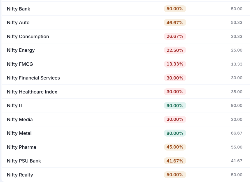
The sector table shows the spread of readings across the selected baskets.
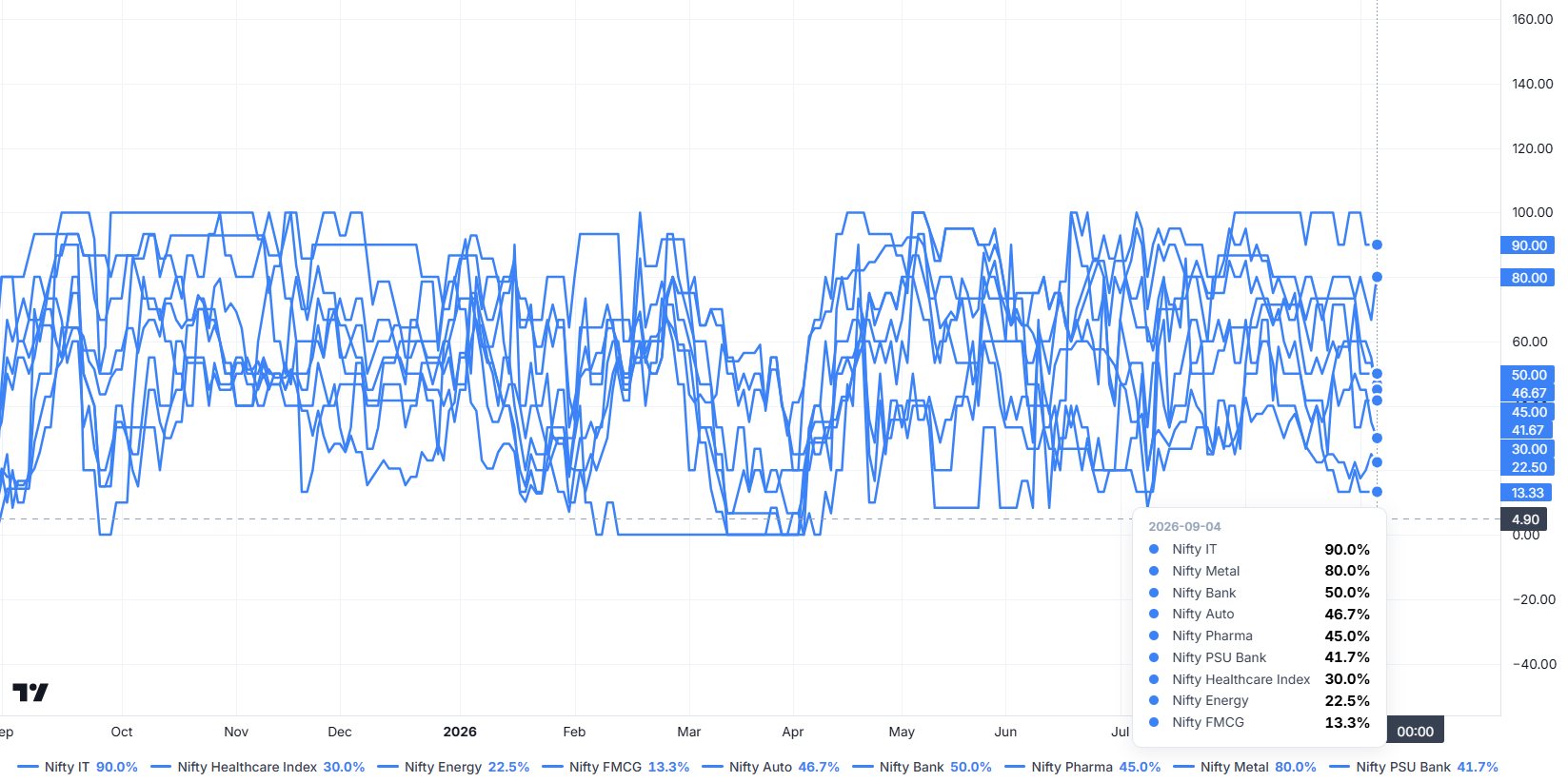
The chart adds historical context. Use the legend and dated tooltip to identify each sector.
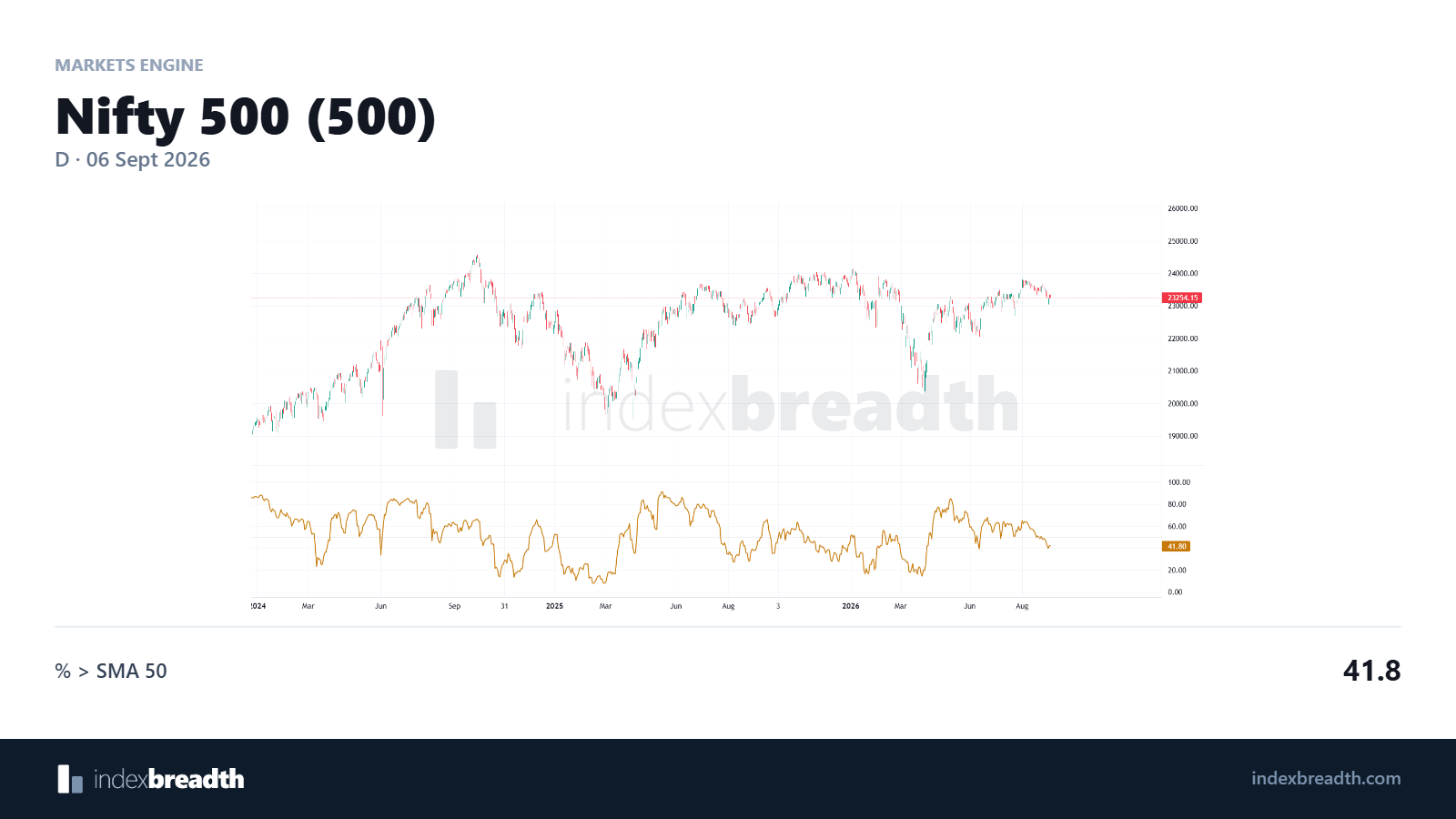
Daily view of Nifty 500 price and SMA 50 participation.
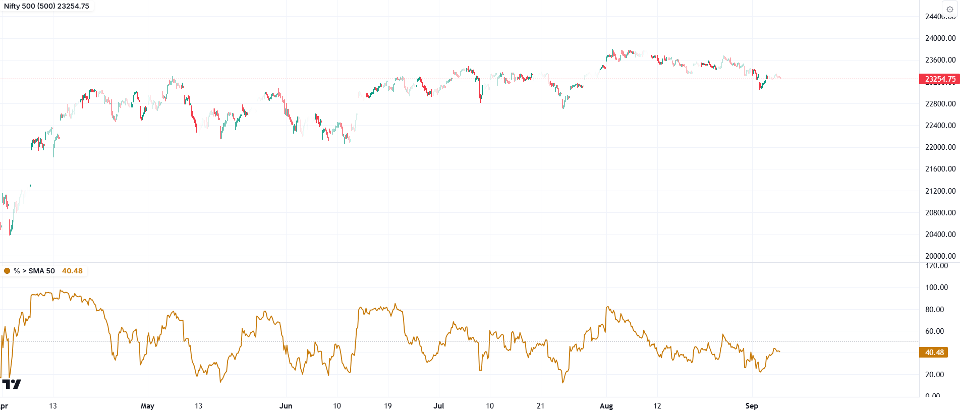
Hourly view for comparison. Keep the selected timeframe in mind when reading a moving-average period.
Charts: IndexBreadth. Select an image to view it at full size. These are historical illustrations, separate from the worked numerical examples in this lesson.