Stocks Above 50 DMA: Measuring Trend Participation
The index may hold its trend. How many stocks are doing the same?
An index can sit above its moving average while many of its stocks sit below theirs. How widely is the trend being shared? That is the question I want a participation reading to answer.
For this introduction, we will use the percentage of stocks above their 50-session simple moving average. It is a public breadth concept, not a proprietary model. StockCharts explains percentage-above-moving-average breadth here.
First calculate each stock’s own average
For stock i, let C(i,t) be its comparable closing price on session t.
SMA50(i,t) = [C(i,t) + C(i,t−1) + … + C(i,t−49)] ÷ 50.
We include the current close and the previous 49 session closes. This is 50 trading observations, not 50 calendar days. Each stock is compared with its own average, not with the index’s average.
Let E be the number of stocks with valid required observations and B the number for which C(i,t) > SMA50(i,t).
Participation = 100 × B/E, provided E > 0.
Here we explicitly use eligible stocks as the denominator. With full coverage, that equals the basket’s total membership. The denominator lesson explains why the distinction matters.
A two-step example
Suppose one stock’s 50 closes sum to ₹5,000. Its SMA50 is ₹100. If today’s close is ₹104, it qualifies as above the average. A close of ₹100 is equal, so it does not qualify under our strict greater-than rule.
Now take a hypothetical 50-stock NSE basket with full data coverage:
| Classification | Stocks |
|---|---|
| Above their own SMA50 | 32 |
| Below their own SMA50 | 17 |
| Exactly at their own SMA50 | 1 |
| Eligible total | 50 |
The reading is 32 ÷ 50 × 100 = 64%. The below-average share is 34%, and the equal share is 2%. I would not call the remaining 36% “below” without accounting for equality.
What 64% tells me—and what it does not
It tells me that a majority of this basket is above the selected trend reference. It does not say the basket has gained 64%, or that there is a 64% probability of a rally.
I would next ask whether participation has been expanding or shrinking. A reading of 64% after 40% has a different recent path from 64% after 90%, even though the current level is identical. Price and the longer-term context still matter.
Shorter moving-average windows generally respond to more recent changes; longer ones put the comparison against a longer price history. Later lessons will treat 20-, 100- and 200-session participation separately rather than assume they are interchangeable.
Where false comfort can appear
A stock just above its average and one far above it both count once. This loses information about distance and potential overextension. Repeated small crossings near the average can also produce noisy changes, especially in small baskets.
Low participation does not guarantee an imminent rebound. High participation does not guarantee an imminent reversal either. I think these levels are more useful as descriptions of the market’s condition than as automatic orders.
On IndexBreadth, check the selected moving-average label, universe and timeframe. Use the visible participation chart alongside price, and keep this public example separate from any assumptions about the platform’s internal processing.
Reading the IndexBreadth charts
These Nifty 500 charts put participation beside price. I would follow whether participation strengthens with a rally and whether it fades while price holds up. The arrows make those comparisons easier to see.
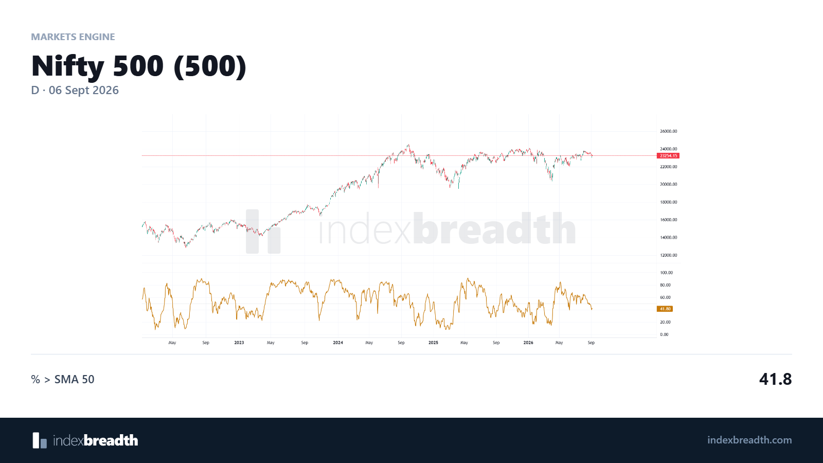
Original IndexBreadth view of price and SMA 50 participation.
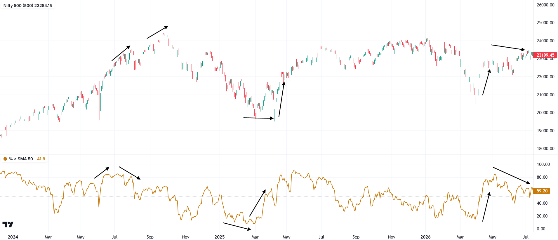
The arrows guide the eye between price and participation. Compare their shapes over matching dates.
Charts: IndexBreadth. Select an image to view it at full size. These are historical illustrations, separate from the worked numerical examples in this lesson.