Hypothetical Case: A Green Index With Narrow Breadth
An Indian-market teaching example of why the headline return can hide participation.
How can the index finish green when most of the stocks in a basket finish red? I think this is one of the most useful questions for an Indian-market reader to work through with actual arithmetic.
This is a hypothetical teaching case, not today’s market report, not an actual Nifty session, and not a trading recommendation. The weights and returns are invented solely to make the relationship clear.
The real Nifty 50 uses a free-float market-capitalisation methodology. Our simplified five-stock basket illustrates the effect of unequal weights; it does not reproduce Nifty constituents or index-maintenance rules.
The invented session
Assume the following beginning-of-session weights, no constituent changes, and no corporate actions during the session:
| Stock | Starting weight | Session return | Contribution |
|---|---|---|---|
| A | 40% | +2.0% | +0.80 percentage points |
| B | 25% | +1.0% | +0.25 percentage points |
| C | 15% | −1.0% | −0.15 percentage points |
| D | 10% | −2.0% | −0.20 percentage points |
| E | 10% | −1.0% | −0.10 percentage points |
The weights sum to 100%. For this simplified one-session basket:
Basket return = sum of starting weight × stock return.
The result is 0.80 + 0.25 − 0.15 − 0.20 − 0.10 = +0.60%. A basket starting at 100 would end at 100.6 under these assumptions.
Now count participation
Two stocks advanced and three declined. None was unchanged.
Advancing share = 100 × 2/5 = 40%.
Net advances = 2 − 3 = −1 stock.
A/D ratio = 2/3 ≈ 0.67.
The basket rose, but a majority of its stocks fell. There is no contradiction. The two advancing stocks carried 65% of the starting weight.
For a separate equal-weight one-session basket, the average return would be (2 + 1 − 1 − 2 − 1)/5 = −0.20%. That is a different weighting scheme, not a correction to the first calculation.
What I would say about this session
I would describe the rise as narrow by stock count and driven by the more heavily weighted names in this example. I would not say that the positive index return is false. It is the correct return for the stated weighting.
I also would not conclude that the next session must fall. This example contains no information about future returns. A small group can continue to lead, or participation can broaden later.
The useful next questions are whether the pattern persists, whether weakness is concentrated in particular sectors, and whether longer-horizon participation confirms or contradicts the daily count.
What the example leaves out
A five-stock basket exaggerates the visibility of each constituent. Real indices involve more names, changing weights and maintenance rules. Liquidity, trading costs and corporate actions also matter when moving from a teaching example to an investable portfolio.
Most importantly, this is a one-session participation comparison. It is not enough to establish a multi-session breadth divergence or to identify a market top.
On IndexBreadth, compare the selected universe’s visible breadth with the relevant price context. For the raw classification behind this case, read advances, declines and unchanged. Future dated market notes can apply the same questions to verified observations, while keeping opinion separate from fact.
Reading the IndexBreadth charts
The numerical case above is imaginary. These Nifty 50 charts are a separate historical visual study using the displayed percentages of stocks with RSI above 70 and below 30. I would use the panels to ask how broadly strength or weakness is distributed, then compare the answer with price.
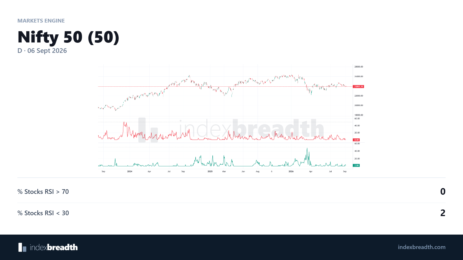
The original view provides the price and RSI participation context.
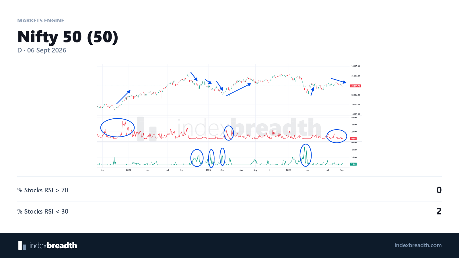
The annotations highlight changes in the two RSI participation series alongside price. Read the circles as points for comparison.
Charts: IndexBreadth. Select an image to view it at full size. These are historical illustrations, separate from the worked numerical examples in this lesson.