Breadth Divergence: A Warning, Not a Trading Signal
Price and participation can disagree without telling us when a reversal will happen.
When an index makes a new high, I want to know whether participation is keeping up. Is the new high shared by more stocks, or is the index getting there with less support?
A divergence describes a disagreement between price and an indicator. It does not, by itself, provide an entry price, an exit rule or a reliable clock for the next reversal.
StockCharts discusses the practical difficulties of identifying divergences, including the time needed for a pattern to become clear. I think that timing problem deserves as much attention as the attractive examples.
Define the measure and comparison
For an introductory participation measure, let B(t) be the number of eligible stocks above a chosen moving average and E(t) the eligible count.
P(t) = 100 × B(t)/E(t), provided E(t) > 0.
Choose two comparable price swing highs at t1 and t2. A simple bearish non-confirmation is:
Index(t2) > Index(t1), while P(t2) < P(t1).
This example compares breadth at the dates of the price swings. It does not search retrospectively for whichever indicator peaks create the prettiest chart.
A hypothetical higher high
Imagine a Nifty-style index and a matched 50-stock basket with complete data. The figures are illustrative, not actual Nifty history.
| Observation | Earlier price swing | Later price swing |
|---|---|---|
| Index level | 24,000 | 24,480 |
| Stocks above the chosen average | 35 | 28 |
| Eligible stocks | 50 | 50 |
| Participation | 70% | 56% |
Price rose 2%, calculated as (24,480/24,000 − 1) × 100. Participation fell 14 percentage points, from 70% to 56%.
That is weaker participation at a higher price swing. It is not a forecast that the index must fall 14%, nor that a correction must begin tomorrow.
What I would do with the warning
I would first check whether the decline in participation survives basic scrutiny: same basket, same average, same observation time and comparable coverage. Then I would look at the price structure and whether weakness is isolated to a small group or becoming broader.
A warning can justify closer monitoring without dictating a trade. If participation later rises above the earlier reading, the non-confirmation has changed. A useful analysis should record that rather than keep repeating an old bearish interpretation.
The bullish version
At two price swing lows, a lower index low with higher participation is a possible bullish divergence under the same convention. For example, 15 of 50 stocks above the average is 30%; 20 of 50 is 40%. An increase from 30% to 40% while price makes a lower low indicates improved participation relative to that benchmark.
It does not establish that the decline has ended. Further price weakness can invalidate the interpretation, and some indicators react slowly after a sharp sell-off.
Common false readings
Changing the lookback after seeing the outcome introduces hindsight. Comparing one universe’s breadth with another universe’s price can create a mismatch. Missing observations can move the denominator. A short-lived disagreement inside an ongoing trend may have little practical value.
Breadth momentum is a related but separate question: how fast participation changes. A divergence compares price and breadth structure; it is not automatically a thrust or a momentum signal.
On IndexBreadth, keep the visible universe and timeframe aligned. If you are new to denominators, read why the eligible stock count matters before treating a falling percentage as a market warning.
Reading the IndexBreadth charts
These charts show why I compare price with more than one view of participation. The first pair uses percentage above SMA 50. The second uses the indicator labelled 5% of 9M High. The marks highlight periods of agreement and disagreement; they provide context for the price action.
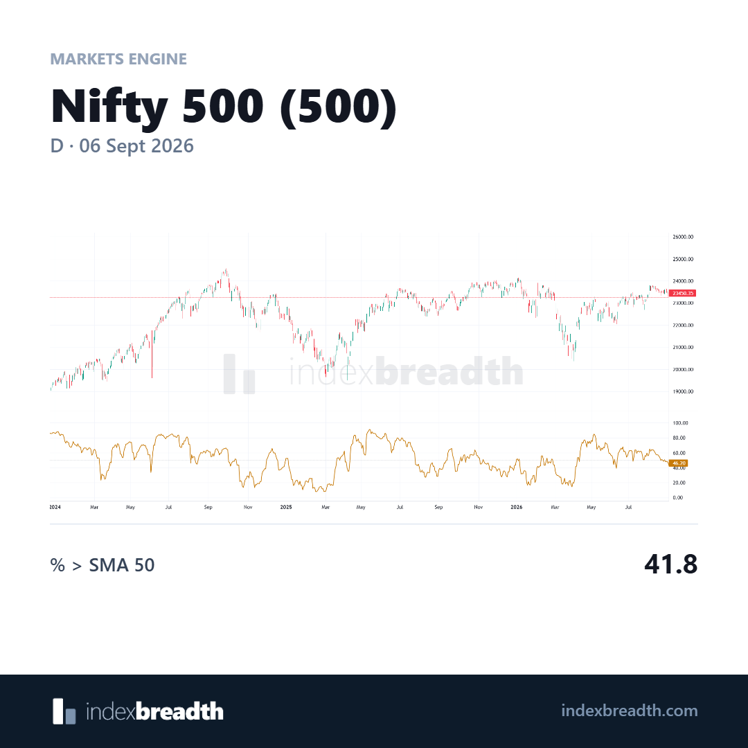
The unmarked view provides the background for the annotated comparison.
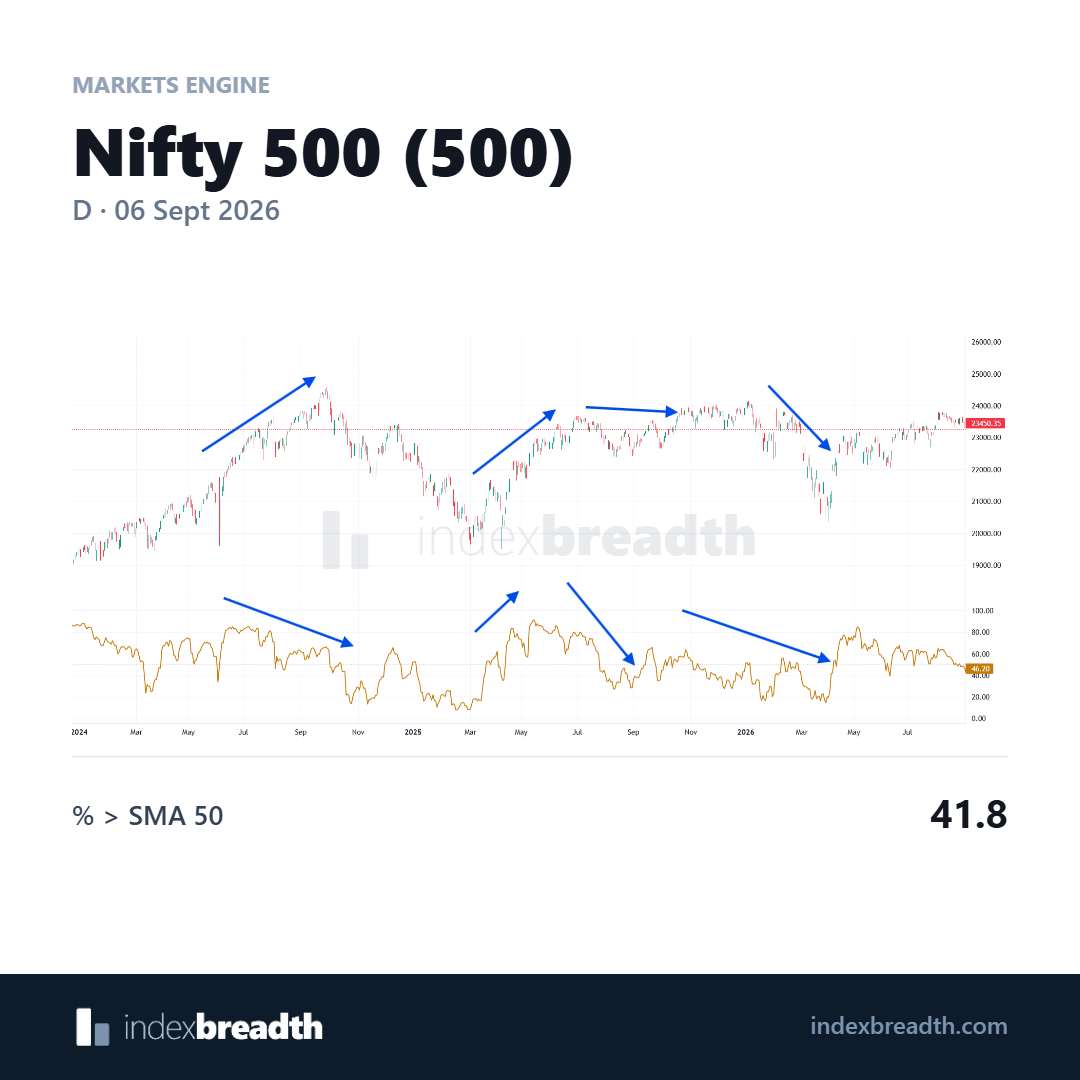
The marked stretches show price and participation taking different paths at times. Follow the relationship over matching dates.
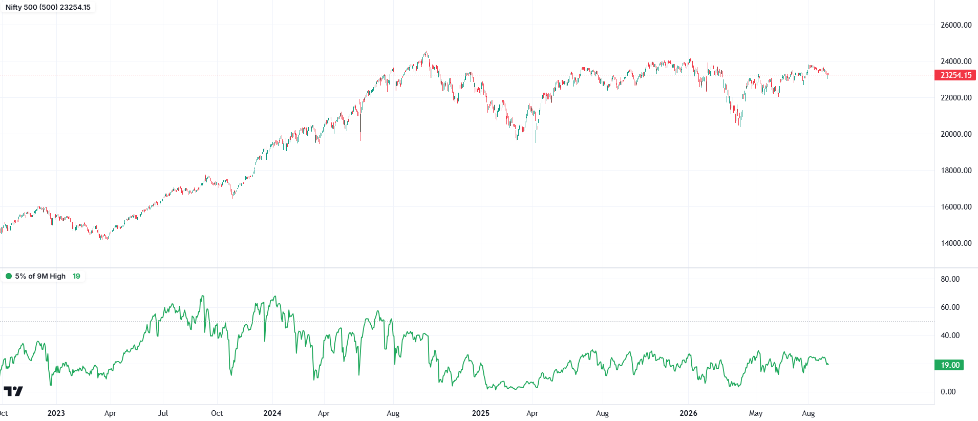
A second view of participation, using the indicator label shown in the chart.
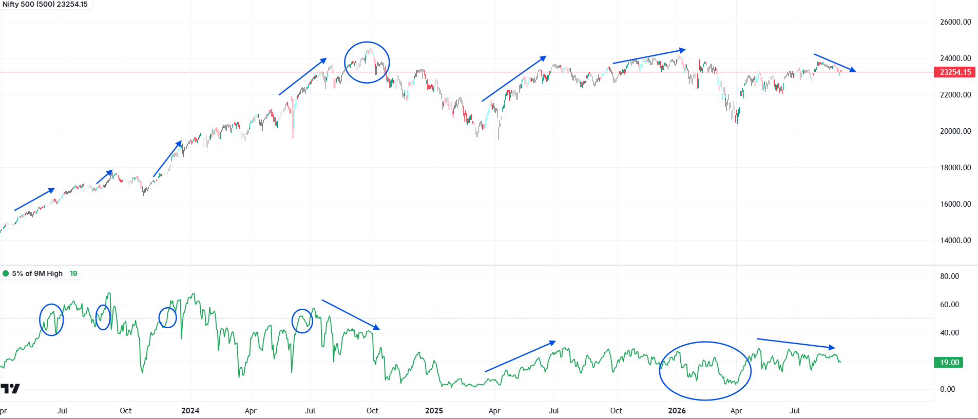
The circles and arrows highlight changes in participation alongside price swings. A rise in the index need not be matched by equal strength in this series.
Charts: IndexBreadth. Select an image to view it at full size. These are historical illustrations, separate from the worked numerical examples in this lesson.