Advance–Decline Line: Calculation and Interpretation
A daily balance becomes a running record of participation.
A strong advance/decline reading tells me something about one session. My next question is whether that participation keeps adding up. Is the balance improving over several sessions, or did we just have one good day?
The advance–decline line gives that daily balance a running history. If you are starting here, read advances, declines and unchanged first.
The public calculation
Let A(t) be advancing stocks and D(t) declining stocks in the same defined universe on session t. Net advances N(t) equal A(t) − D(t).
ADL(t) = ADL(t−1) + A(t) − D(t).
This is the standard cumulative construction described in StockCharts’ A/D line reference. For our example, we start ADL at zero. Other starting values shift the line vertically without changing the subsequent daily additions.
Unchanged stocks contribute neither an advance nor a decline. Missing observations need their own treatment; they should not silently become unchanged stocks.
Build it over five sessions
Imagine a hypothetical basket of 100 eligible NSE stocks. Every session has five unchanged stocks.
| Session | Advances | Declines | Net advances | A/D line |
|---|---|---|---|---|
| 1 | 60 | 35 | +25 | 25 |
| 2 | 45 | 50 | −5 | 20 |
| 3 | 65 | 30 | +35 | 55 |
| 4 | 40 | 55 | −15 | 40 |
| 5 | 55 | 40 | +15 | 55 |
The line ends at 55 because 25 − 5 + 35 − 15 + 15 = 55. That is a cumulative net count across sessions. It does not mean 55 different stocks advanced during the period: the same stocks can contribute repeatedly.
If we had started at 1,000 instead of zero, the final reading would be 1,055. I would study direction and turning points rather than attach meaning to the arbitrary level.
What I would compare with price
For a Nifty-universe study, I would align the breadth series with the corresponding index and observation times. If both price and the A/D line make higher swing highs, participation is confirming that price structure under this measure.
If price makes a new swing high while the line stays below its previous swing high, I would investigate a possible divergence. I would not translate that immediately into a forecast of a market top. Persistent leadership by a narrower group can keep a weighted index rising.
The line also helps distinguish a sequence of positive daily balances from a single spectacular session followed by weak participation. Two paths can finish at the same cumulative value while telling different stories along the way.
What the line cannot tell us
A stock gaining 0.1% and another gaining 5% each count once. A/D breadth therefore does not replace return, volume or liquidity analysis. Changes in universe size affect raw additions, and historical constituent choices affect the sample.
A cumulative A/D line is also not automatically a breadth thrust. A thrust requires its own explicitly defined conditions and time window. Adding daily net advances does not create those rules.
I think the best use is as a participation record alongside price. On IndexBreadth, check the visible universe and timeframe before making that comparison. For the wider mathematical context, return to Breadth Analysis 101.
Reading the IndexBreadth charts
I find it easier to read the A/D line alongside the index. These IndexBreadth charts show price and breadth over different windows. The marked view highlights periods where their direction and strength differ. I use that relationship as context, rather than a timetable for a reversal.
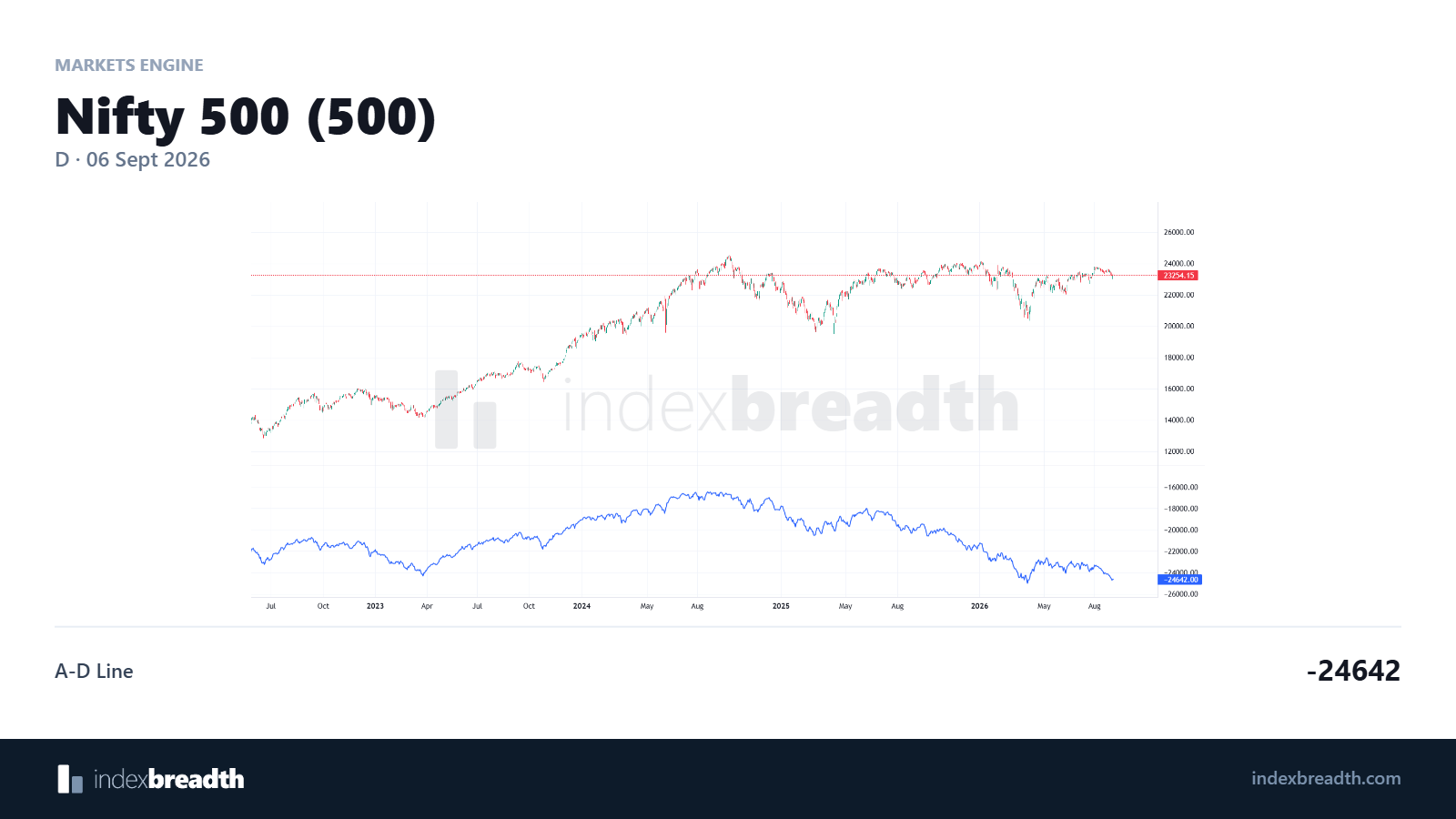
The unmarked view gives us the price and breadth context.
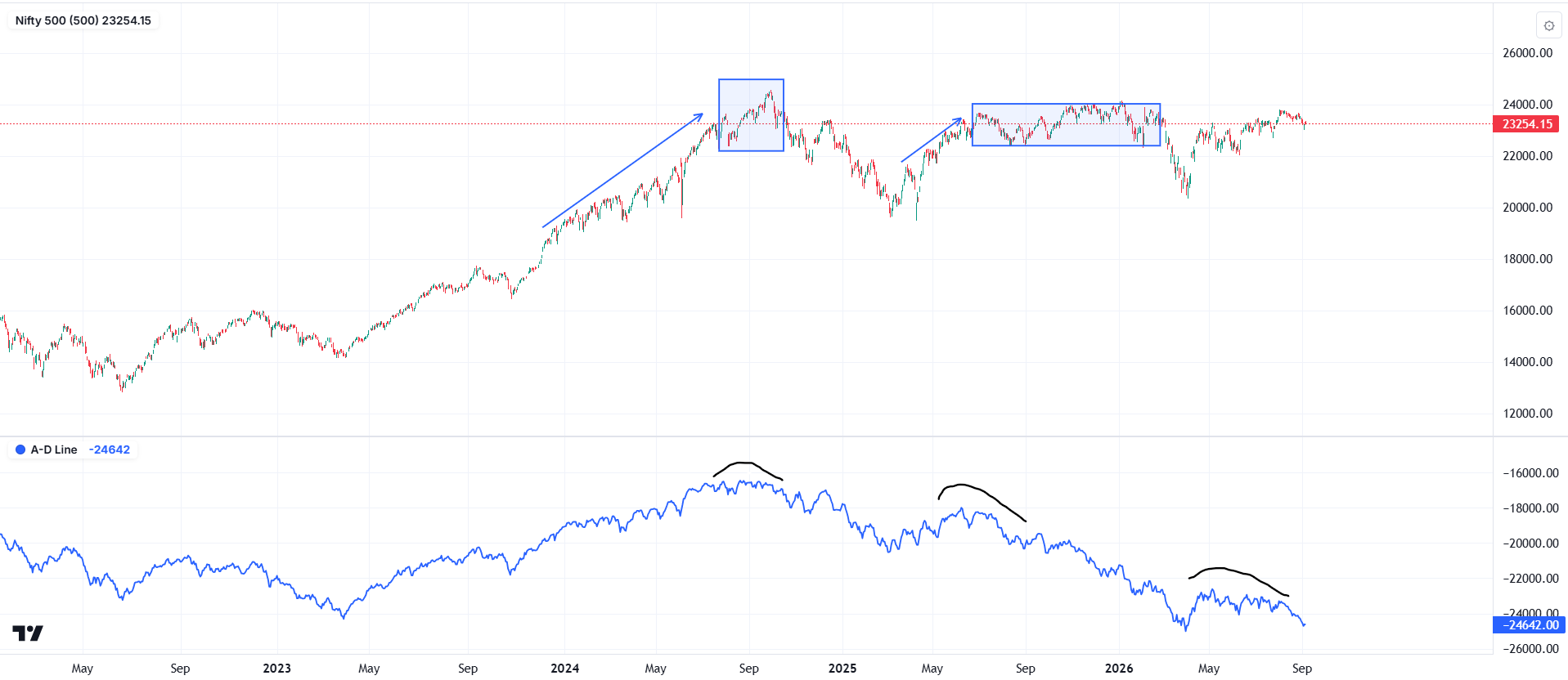
The annotations highlight how the A/D line behaves alongside price swings. Read the two panels over matching dates.
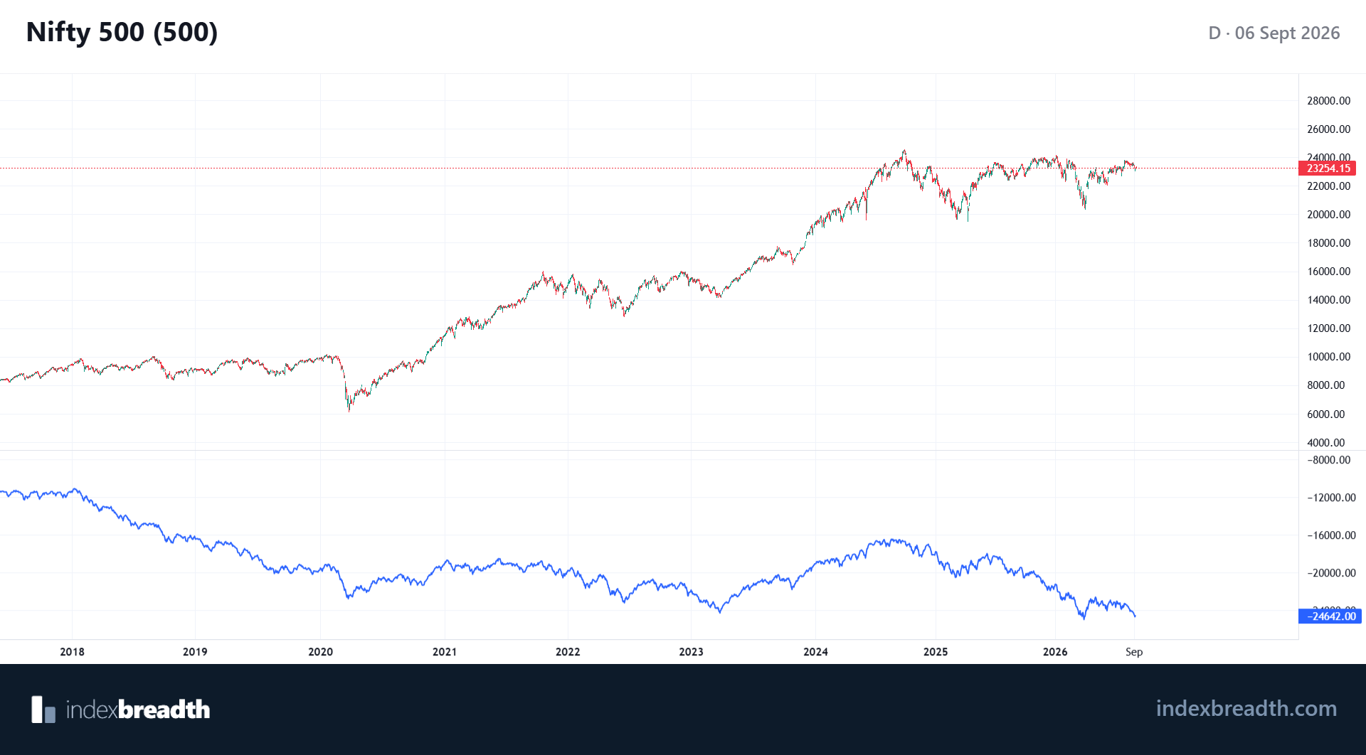
The longer view adds context to the cumulative A/D line.
Charts: IndexBreadth. Select an image to view it at full size. These are historical illustrations, separate from the worked numerical examples in this lesson.